Showing posts with label teaching. Show all posts

May 27, 2016

Useables! And my first Zine.

Here ya go. Have some free snaps and textures to do with as you please. For personal or business use.

Me? I'm made a quick Zine. Pulling some random selections from one of my 2015 sketchbooks. Which include some pics of snack wrappers and paper ephemera. I glue all sorts of dumb things into my books.


You have my full permission to use these images for your own project. Do whatever... Just go make something!
Show me and I'll feature your work here or on Facebook.
I'll even trade you Zines.

Like em? Want more? Let me know in the comments and every once in a while I'll toss a few up.

Oh yeah... Zine how-to here.
UPDATE: When using the template instructions in the link. Revers the "front page" and "back page" positions. otherwise your Zine will open in reverse.


May 20, 2015

Learned something after a recent flea market scavenge.

Remember in the old silly symphonies (or was it Looney Toons) how Goofy (or was it Bugs?) would take out a pencil and give it a teasing lick before writing? When I was a kid, I always wondered why cartoon characters would lick the tips of their pencils. I asked my mom and she she had nothing for me. Eventually I settled on it simply being a gesture of initiating concentration.
But, could they have been using these pencils?


At our last Flea market scavenge I picked up this box of old pencils. Thought "Hey, cool. Old drafting pencils!" We once found a box of old dip pen nibs. Most of em are completely usable!
Plus, I think it was just $2 for a full unused box. So why not!
Got home and took a closer look.

Indelible copying pencil?... What does that mean. Quick to Google!
Blah blah... Used for making permanent signatures "ok, cool."... Blah blah... Turns purple when dampened "Wow, that'll be fun!"... Blady blah blah... Acne, lung problems "WHUT! What did I just buy a whole box of?!"

As Wiki has it...
Or, if you don't care zoom down to the bottom for an example sketch and video.


Copying pencil

copying pencil, also indelible pencil, is pencil whose lead contains a dye. The lead is fabricated by adding a dry water-soluble permanent dye to powdered graphite—used in standard graphite pencils—before binding the mixture with clay.[1][2]
Copying pencils were introduced in the 1870s, and were originally marketed for copying documents, especially for making permanent copies of a permanent original. This was achieved by creating a hand written document using a copying pencil, laying a moist tissue paper over the document and pressing down with a mechanical press. The water-soluble dye in the writing would be transferred in its mirror-image to the tissue paper, which could then be read in verso by holding it up to a light source.[1] According to conservationist, Liz Dube, "By the 1870's, letter copying books became the ubiquitous copying tool for businesses. These volumes contained hundreds of leaves of thin tissue paper, often high quality Japanese papers, bound together for the purpose of bearing copies of outgoing correspondence and other business documents."[1]
The most commonly used dye was aniline which produced a stain that was bright purplemauve, or some color in between, depending upon the manufacturer. Since the aniline dye was poisonous to humans, many injuries and illness related to copying pencils were reported in the medical literature, especially in the late-19th- and early-20th centuries.[2]
By the end of the 19th century, better copying methods had become available. Consequently, the copying pencil was being used as an indelible pencil, a precursor to the ball-point pen. When used dry, it left a slightly-purplish gray mark on paper, not dissimilar to a lead pencil's, but which could not be erased.[1] When used wet, its tip moistened repeatedly by water or saliva, it produced a bright purple writing. The copying pencil served as a convenient substitute for the fountain-pen: it could be carried on one's person without need for ink or fear of leaks.[1] Furthermore, for producing copies using carbon paper, copying pencils were considered superior to both ordinary pencils (whose writing in the original could be erased) and fountain-pens (whose nibs could not always withstand the pressure needed to produce the carbon-copy).[1]
Copying pencils saw extended use in World War I in the completion of a wide range of paperwork. However, with the advent of refined ball-point pen technology in the 1930s, their use gradually died off in much of the world.[1] They saw longer use in some places. In India, they were commonly used for writing addresses on registered mail parcels which were required by law to be wrapped in cloth. For writing an address on cloth, a moistened copying pencil was preferred to a pen, whose nib could easily get caught in the weave. In Italy, their use is still mandated by law for voting paper ballots in elections and referenda.[3] During their heyday, copying pencils were also associated, across the world, with the image of a railway conductor, who famously carried one tucked behind an ear.

Health risks

Indelible pencils were the cause of significant health risks due to the presence of aniline dyes. Exposure to aniline dyes could lead to eczema, acne and carcinoma. Penetration of the pencil lead into the body commonly leads to severe and debilitating effects such as fever, anaemia, elevated white cell count, gastro-intestinal upset, kidney and liver damage, anorexia and necrosis of the tissue surrounding the wound. Such risks are not associated with ordinary graphite pencils. While these symptoms may appear after a couple of days they often develop only after weeks have passed since the injury was sustained. Surgery is required to remove the lead and the infected tissue and "the necrotizing action may be so severe and extensive amputation is necessary".[4]

Ok great, I have a bunch of pencils I'm afraid to use... But they might be the answer to my childhood question. "Mama, Why does Goofy lick the end of his pencil before writing?"

October 27, 2014

Take a walk-through with me. NSFW, by the way.

So, how about a progress walk through for Behold, God? You game.

TLDR gif for your convenience.


To kick off, here's something you might find surprising about this work. Its concept came about when I saw this photo by Vaxzone on Deviantart.


Can you see the connection?
Maybe if I show you the way I saw it... It was actually due to miss interpreting the negative space and colors. 

Here's what happened.
I was digging around DA for something... No clue what the search was about at the time. It's been long forgotten at this point. When a glance was stolen at a thumbnail image hiding in the "More from" column. My sight is so poor that when my attention fluttered by, I saw a lanky limbed woman seated on a throne of clouds. Took a second glance and saw the image correctly. But the idea had been sparked. So a screen capture was taken and a fast doodle was thrown down as a reminder of what I saw. Ultimately to be filed away for a later date.
Thankfully the open call from Slushbox dropped in my lap at almost the same time. Which pushed the concept into production, instead of allowing it to languish in forgotten files.
Like most "flash of inspiration" ideas. 

Concept sketch.
Working sketch.
Usually, as I'm working I'll find images to cobble together to help build the idea as fast as possible. 
Rather than laboring exhaustively over a small piece or humoring an idea for hours that might not work out. 
I have such a short attention span and tolerance for difficulty that I tend to drop a project for months at a time if I get stuck evaluating all possibilities. This generally happens while working out poses and compositions. 
It turns into a flurry of "oh what if the arm was nudged a little this way?" or "maybe it'll look better nudged just a little more. Or maybe the other way." and "what if it's just switched around?" to "how about dropping it down instead" and again "let's nudge it this way, now the other way... How about up? Maybe it looked better the way it was before." Over and over and over. Till the options get so confusing I don't know what's going on anymore. The biggest danger is potentially  loosing sight of what you really wanted in the first place. 
So by "clip art'ing" I can at least see if a supporting idea or object will work out, right away. For me, it's about keeping things moving as smoothly as possible in the early stages or I'll just throw my hands in that air an walk away to go pout.
I believe there's a term for it, Analysis paralysis.


I think this one comes next...
Or maybe this one... See, the changes are so minimal that I can't even remember which version was actually saved first
.
The original concept wasn't working and caused too many headaches. It was time a for a redraw. Above is a Photoshop colorized sketchbook page. 

It was also time for a redraw and tightening of the "Goddess"

Everything's coming together. Chunky flat colors will get thrown in for readability.
Plotting paths for hair cascades.
Taa Daa!
Blocking in the midtones and highlights.
Let's try something out here.
Color palettes are always a challenge and will change several times.
At this point the sketch is finalized and ready for penciling.

                                       
LIGHTBOX TIME, GO!
To get all the line work detail wanted, the image was divided into four separate sections. Penciled, scanned and reassembled in Photoshop.

The shading seen above was done on as a separate component and scanned after the pencils. I like to keep the two separate just have on hand if I ever want to work with the image in a different medium. It's likely the most confusing, work intensive and an all together busted way to work, but at the time it felt like the most "medium open" option. 
If you think that's in any way pointless then you should see the maddening way I handle my Photoshop files.
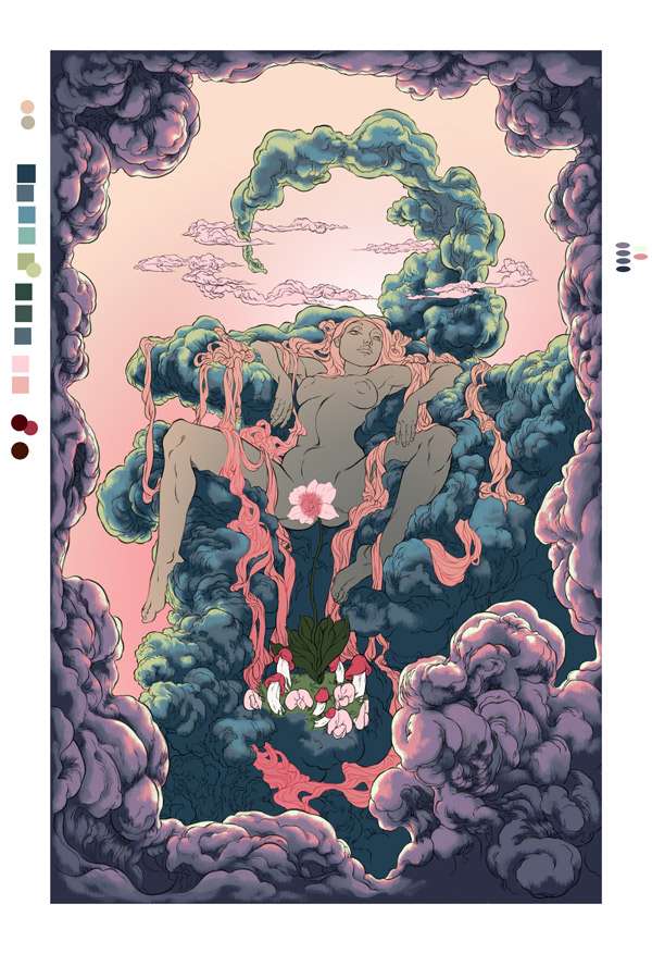
More color adjustments.
Till we get something a little more unconventional. At least I felt so. Still playing around with the rays of light till it was decided to just stop fighting with it and go with the simplest effect


That pretty much runs through the whole thing. 
Thanks for walking with me. Next time I'll try to keep my hands to myself. Promise.

July 10, 2014

Pearl EX Pigment Powder Step-by-Step.


Welcome to my first "Step-by-Step" post. I'll be taking you through the process I went through in painting fairy wings for the "Froud Fairy" Custom. Using Pearl EX brand pigment powders.
Enjoy!


REFERENCE
The customer requested a custom MLP (my little pony) based off the iconic Brian Froud image below.

TOOLS
Metal Dental tool with concave paddle end. Used for scooping portions, "parts" of pearl dust.
1/4 square craft brush. Used to cover large areas.
#0 round craft brush. Used for painting details.
Chroma brand, Jo Sonja Gloss Varnish. Used as a mixing medium for pearl dust.
Peal EX Pigment powders.
COLORS USED
Pic of palette, for the heck of it. I really believe something can be learned by studying artists' palettes.

MEASUREMENTS
That is indeed a slowly thawing green pea you see there. When I say "Pea sized" Just call me queen literal.
So when you read a "part" of dust I mean roughly a pea sized scoop. And when you read a "part" of glaze. I mean roughly a dime sized pool. Which was generally three to four drops. Depending how well I could control the bottle. I'm terrible with wasting glaze.

FIRST COLOR
Antique Copper: 2-parts powder to 1-part glaze.
Starting out with the darkest color. Consider this the foundation color. No need to be neat, all other colors will build on top of this layer. Just smoosh it around and get a feel for the powder's behavior.

PRO-TIP Note: Base coating your substrate (A material on which a process is conducted.) can greatly enhance or augment the visual outcome of the powders.
For example, I chose to base coat the wings in a matte black. Payne's gray really. 

A black background pops the powders forward, appearing brighter and more vibrant. Where as a white background can draw them back. Making them more subtle. This does not mean that they look dull. Don't get the wrong idea.  Traditionally gray is also used as a neutral backing.
In the case of Gold tones I also could have used a terracotta color. In the Gilding profession, terracotta is used to make gold leafing appear warmer, brighter. Giving it a red glow. Alternatively a navy blue can be used to cool it down, mimicking a bronze-gold or slight inner patina look. The same cause and effect can be used with both pearl powders and metallic paints.


SECOND COLOR
Super Bronze: 1-part powder to 1-part glaze.
This color finishes the foundation.  After this "land mark" colors come into play.   

THIRD COLOR
Super Copper: Glaze mixture.
My apologies... The subtle difference might not be noticeable in these photos. No matter how I try to capture it.
This copper was mixed with 1/2 a part dust to 1 part glaze. Resulting in a glazing medium. Making it easier to blend with the other two colors. In addition, "double dip" loading was used. 
Double dipping is when you load your brush with one color, then dip the tip in a second color. It allows for ease of wet-on-wet blending in tiny areas. 

Glaze: Is a thin transparent color. Or paint that has been "watered" down with the aid of a medium. 
Glazing: A term used in painting. Referring to the translucent color layer over an opaque layer. More light passes through this thinned layer, allowing the layer below to be reflected back. Resulting in a more complex and deeper visual mix of color unattainable in solid color mixing.  
*Forgive the wonky definitions. I know they're awkwardly written. It was surprisingly difficult to find a short, copy-pastable blurb that wasn't two paragraphs long. But this is what Google is for after all. 
Glazing mixture example on your left. Opaque example on your right.

FOURTH COLOR
Sparkle Gold: 1-part dust to 1-part glaze. 
Here's where we lay down the areas that will become "landmarks"
Landmarks are open or large areas of color,  generally light in tone, that the eye naturally pauses or "rest" on in cases of detail heavy images. Also known as "breather spaces"
Notice how more contrast is starting to emerge.   

FIFTH COLOR
Interference Gold & Interference Violet: Both mixtures are 2-parts dust to 1-part gloss. 
Mixture consistency is more of a paste for this layer. As more opacity is needed. Of The two colors, interference gold is more naturally opaque. It was layered first.  Then interference violet was brushed on top to add it's pink hue and help break up the very gold heavy sheen.   

SIXTH COLOR
Duo Red/Blue: 1/2-part dust to 1-part gloss. 
At one angle, this powder reflects a soft translucent pink at another it becomes an opaque shimmering indigo.

ADJUSTMENT LAYER & FINISHING TOUCH UPS: 2 parts
Part 1: Aztec Gold: 1/2-part dust to 1-part gloss. 
Aztec Gold was used as a glaze to brighten and break up a couple bronze spots. Such as the bottom most wing. See how it appears a little less red compared to the picture above.
Part 2: Antique silver / Antique Copper- 1-part silver and 1-part copper dust (mixed) to 1-part gloss.
This silver / copper mix was used to darken key areas. Adding more contrast. Mostly in the tip of the first wing. Around the "eyes" pattern.
Finally... Added a little more Super-Copper (Glaze mixture) to brighten some yellow-gold heavy areas and finished off with three layers of solid glaze for protection and done!

And there you have it! Hope you get some use out of this.
If you see something I could have explained clearer or photo'd better please let me know. Help me to make better content for you. And feel free to ask me anything about my work or process. Your question could be used for the next step-by-step.
Type y'all later!
Tam
